Analyzing Sales Performance:
E-Commerce Insights from Indian Market

In this project, I delved into the dynamic landscape of Indian e-commerce, exploring the intricacies of sales performance through meticulously curated data.

Tool used: R Programming Language

Introduction

Welcome to the world of e-commerce sales analysis! In this dataset, i delved into the dynamic landscape of Indian e-commerce, exploring the intricacies of sales performance through meticulously curated data. the dataset, sourced from Kaggle, comprises three comprehensive CSV files: List of Orders, Order Details, and Sales Targets.

Dataset Overview

  1. List of Orders: This dataset offers a detailed glimpse into purchase information, featuring essential data points such as Order ID, Date of Purchase, and Customer Details.
  2. Order Details: Dive deeper into the specifics of this dataset, which includes Order ID, Order Price, Quantity, Profit, and detailed Category and Subcategory information.
  3. Sales Target: Gain insight into the overarching goals and aspirations of each product category with this dataset, showcasing sales target amounts and dates.

Loading Package

I started by loading and installing the package required for necessary data cleaning, analysis and visualization

library(tidyverse)

## ── Attaching core tidyverse packages ──────────────────────── tidyverse 2.0.0 ──
## ✔ dplyr     1.1.4     ✔ readr     2.1.5
## ✔ forcats   1.0.0     ✔ stringr   1.5.1
## ✔ ggplot2   3.5.0     ✔ tibble    3.2.1
## ✔ lubridate 1.9.3     ✔ tidyr     1.3.1
## ✔ purrr     1.0.2    
## ── Conflicts ────────────────────────────────────────── tidyverse_conflicts() ──
## ✖ dplyr::filter() masks stats::filter()
## ✖ dplyr::lag()    masks stats::lag()
## ℹ Use the conflicted package (<http://conflicted.r-lib.org/>) to force all conflicts to become errors

library(lubridate)

Load Datasets

The next step was to load the dataset required for analysis

Order_List<- read.csv(“C:\\Users\\USER\\Documents\\PERSONAL\\DATA ANALYTICS\\My Portfolio\\R Studio\\List of Orders.csv”)
Order_Details<- read.csv(“C:\\Users\\USER\\Documents\\PERSONAL\\DATA ANALYTICS\\My Portfolio\\R Studio\\Order Details.csv”)
Sales_Target<- read.csv(“C:\\Users\\USER\\Documents\\PERSONAL\\DATA ANALYTICS\\My Portfolio\\R Studio\\Sales Target.csv”)

Data Cleaning and Exploration

I cleaned and explored each dataset for analysis

Order_List Dataset

glimpse(Order_List)

## Rows: 500
## Columns: 5
## $ Order.ID     <chr> “B-25601”, “B-25602”, “B-25603”, “B-25604”, “B-25605”, “B…
## $ Order.Date   <chr> “1/4/2018”, “1/4/2018”, “3/4/2018”, “3/4/2018”, “5/4/2018…
## $ CustomerName <chr> “Bharat”, “Pearl”, “Jahan”, “Divsha”, “Kasheen”, “Hazel”,…
## $ State        <chr> “Gujarat”, “Maharashtra”, “Madhya Pradesh”, “Rajasthan”, …
## $ City         <chr> “Ahmedabad”, “Pune”, “Bhopal”, “Jaipur”, “Kolkata”, “Bang…

I converted the ‘order_Date’ column from character datatype to date datatype

Order_List$Order.Date<- dmy(Order_List$Order.Date)
glimpse(Order_List)

## Rows: 500
## Columns: 5
## $ Order.ID     <chr> “B-25601”, “B-25602”, “B-25603”, “B-25604”, “B-25605”, “B…
## $ Order.Date   <date> 2018-04-01, 2018-04-01, 2018-04-03, 2018-04-03, 2018-04-…
## $ CustomerName <chr> “Bharat”, “Pearl”, “Jahan”, “Divsha”, “Kasheen”, “Hazel”,…
## $ State        <chr> “Gujarat”, “Maharashtra”, “Madhya Pradesh”, “Rajasthan”, …
## $ City         <chr> “Ahmedabad”, “Pune”, “Bhopal”, “Jaipur”, “Kolkata”, “Bang…

Order_Details Dataset

glimpse(Order_Details)

## Rows: 1,500
## Columns: 6
## $ Order.ID     <chr> “B-25601”, “B-25601”, “B-25601”, “B-25601”, “B-25602”, “B…
## $ Amount       <int> 1275, 66, 8, 80, 168, 424, 2617, 561, 119, 1355, 24, 193,…
## $ Profit       <int> -1148, -12, -2, -56, -111, -272, 1151, 212, -5, -60, -30,…
## $ Quantity     <int> 7, 5, 3, 4, 2, 5, 4, 3, 8, 5, 1, 3, 3, 4, 6, 2, 1, 2, 9, …
## $ Category     <chr> “Furniture”, “Clothing”, “Clothing”, “Electronics”, “Elec…
## $ Sub.Category <chr> “Bookcases”, “Stole”, “Hankerchief”, “Electronic Games”, …

Sales_Target Dataset

glimpse(Sales_Target)

## Rows: 36
## Columns: 3
## $ Month    <chr> “Apr-18”, “May-18”, “Jun-18”, “Jul-18”, “Aug-18”, “Sep-18”, “…
## $ Category <chr> “Furniture”, “Furniture”, “Furniture”, “Furniture”, “Furnitur…
## $ Target   <int> 10400, 10500, 10600, 10800, 10900, 11000, 11100, 11300, 11400…

Summary Statistics

Let’s summarize the dataset before carrying further analysis and answering the business questions

summary(Order_List)

##    Order.ID           Order.Date         CustomerName          State         
##  Length:500         Min.   :2018-04-01   Length:500         Length:500       
##  Class :character   1st Qu.:2018-07-20   Class :character   Class :character 
##  Mode  :character   Median :2018-11-05   Mode  :character   Mode  :character 
##                     Mean   :2018-10-21                                       
##                     3rd Qu.:2019-01-25                                       
##                     Max.   :2019-03-31                                       
##      City         
##  Length:500       
##  Class :character 
##  Mode  :character 
##                   
##                   
##

summary(Order_Details)

##    Order.ID             Amount           Profit            Quantity    
##  Length:1500        Min.   :   4.0   Min.   :-1981.00   Min.   : 1.000 
##  Class :character   1st Qu.:  45.0   1st Qu.:   -9.25   1st Qu.: 2.000 
##  Mode  :character   Median : 118.0   Median :    9.00   Median : 3.000 
##                     Mean   : 287.7   Mean   :   15.97   Mean   : 3.743 
##                     3rd Qu.: 322.0   3rd Qu.:   38.00   3rd Qu.: 5.000 
##                     Max.   :5729.0   Max.   : 1698.00   Max.   :14.000 
##    Category         Sub.Category     
##  Length:1500        Length:1500      
##  Class :character   Class :character 
##  Mode  :character   Mode  :character 
##                                      
##                                      
##

summary(Sales_Target)

##     Month             Category             Target    
##  Length:36          Length:36          Min.   : 9000 
##  Class :character   Class :character   1st Qu.:10050 
##  Mode  :character   Mode  :character   Median :11450 
##                                        Mean   :12108 
##                                        3rd Qu.:14500 
##                                        Max.   :16000

Business Questions

  1. What is the total sales revenue for each month?

In answering this question, i joined both the Order_List and Order_Details table using the inner join function

Sales_Table<- inner_join(Order_List, Order_Details, by = “Order.ID”)

Afterwards, i calculated the sales of each transaction

Sales_Table<- mutate(Sales_Table, Sales = Amount * Quantity)

Additionally, I formatted the date column to a character datatype to display both the month names and year when calculating the sales for each month.

Sales_Table$Order.Date<- format(Sales_Table$Order.Date, format = “%b-%y”)
glimpse(Sales_Table)

## Rows: 1,500
## Columns: 11
## $ Order.ID     <chr> “B-25601”, “B-25601”, “B-25601”, “B-25601”, “B-25602”, “B…
## $ Order.Date   <chr> “Apr-18”, “Apr-18”, “Apr-18”, “Apr-18”, “Apr-18”, “Apr-18…
## $ CustomerName <chr> “Bharat”, “Bharat”, “Bharat”, “Bharat”, “Pearl”, “Pearl”,…
## $ State        <chr> “Gujarat”, “Gujarat”, “Gujarat”, “Gujarat”, “Maharashtra”…
## $ City         <chr> “Ahmedabad”, “Ahmedabad”, “Ahmedabad”, “Ahmedabad”, “Pune…
## $ Amount       <int> 1275, 66, 8, 80, 168, 424, 2617, 561, 119, 1355, 24, 193,…
## $ Profit       <int> -1148, -12, -2, -56, -111, -272, 1151, 212, -5, -60, -30,…
## $ Quantity     <int> 7, 5, 3, 4, 2, 5, 4, 3, 8, 5, 1, 3, 3, 4, 6, 2, 1, 2, 9, …
## $ Category     <chr> “Furniture”, “Clothing”, “Clothing”, “Electronics”, “Elec…
## $ Sub.Category <chr> “Bookcases”, “Stole”, “Hankerchief”, “Electronic Games”, …
## $ Sales        <int> 8925, 330, 24, 320, 336, 2120, 10468, 1683, 952, 6775, 24…

Finally, I calculated the sales for each month

Sales_Table %>%
  select(Order.Date, Sales) %>%
  group_by(Order.Date) %>%
  summarise(Total_Sales = sum(Sales)) %>%
  arrange(desc (Total_Sales))

## # A tibble: 12 × 2
##    Order.Date Total_Sales
##    <chr>            <int>
##  1 Jan-19          337229
##  2 Mar-19          321750
##  3 Nov-18          229785
##  4 Feb-19          177620
##  5 Oct-18          176663
##  6 Dec-18          164839
##  7 Apr-18          152827
##  8 Aug-18          151514
##  9 May-18          138767
## 10 Sep-18          132717
## 11 Jun-18          110015
## 12 Jul-18           53144


Visualizing the above

ggplot(Sales_Table, aes(x = Order.Date, y = Sales)) +
  geom_bar(stat = “identity”, fill = “blue”) +
  labs(title = “Monthly Performance Analysis”, X = “Date”, y = “Total Sales”, caption = “Data sourced from Kaggle”)+
  theme(axis.text.x = element_text(angle = 90)) +  theme(plot.title = element_text(hjust = 0.4))

  • The top three performing months were January-2019, March-2019 and November-2018
  1. Which category has the highest sales revenue in the given period?

Sales_Table %>%
  select(Category, Sales) %>%
  group_by(Category) %>%
  summarise(Total_Sales = sum(Sales)) %>%
  filter(Total_Sales == max(Total_Sales))

## # A tibble: 1 × 2
##   Category    Total_Sales
##   <chr>             <int>
## 1 Electronics      816583

  • From the above, Electronics was the top performing product category
  1. How does the sales target for each category vary month by month?

Sales_Target %>%
    select(Category, Target, Month) %>%
    group_by(Month, Category) %>%
    summarise(Total_Target = sum(Target))

## `summarise()` has grouped output by ‘Month’. You can override using the
## `.groups` argument.

## # A tibble: 36 × 3
## # Groups:   Month [12]
##    Month  Category    Total_Target
##    <chr>  <chr>              <int>
##  1 Apr-18 Clothing           12000
##  2 Apr-18 Electronics         9000
##  3 Apr-18 Furniture          10400
##  4 Aug-18 Clothing           14000
##  5 Aug-18 Electronics         9000
##  6 Aug-18 Furniture          10900
##  7 Dec-18 Clothing           16000
##  8 Dec-18 Electronics         9000
##  9 Dec-18 Furniture          11400
## 10 Feb-19 Clothing           16000
## # ℹ 26 more rows

  • The monthly targets for each product category vary. For Furniture, the monthly target changes range from +100 to +500 units. Clothing targets were increased by 2000 units quarterly in 2018, but remained constant after an increase in Q3 2018. Electronics targets were steady throughout 2018 but saw a significant 77% increase from 9000 to 16,000 units per month in January 2019, remaining constant thereafter.
  1. Which city has the highest number of orders?

Sales_Table %>%
  select(City, Quantity) %>%
  group_by(City) %>%
  summarise(Order_Count = sum(Quantity)) %>%
  filter(Order_Count == max(Order_Count))

## # A tibble: 1 × 2
##   City   Order_Count
##   <chr>        <int>
## 1 Indore        1084

  • The city with the highest number of orders was Indore
  1. What is the average profit margin for each category?

Firstly, i calculated the profit margin of each transaction

Sales_Table<- mutate(Sales_Table, Profit_Margin = (Profit/Sales)* 100)

I then calculated the average profit margin for each category and housed it in a new variable

P_Margin <- Sales_Table %>%
  select (Category, Profit_Margin) %>%
  group_by(Category) %>%
  summarise(Avg_Profit_Margin = mean(Profit_Margin))
print(P_Margin)

## # A tibble: 3 × 2
##   Category    Avg_Profit_Margin
##   <chr>                   <dbl>
## 1 Clothing                1.68
## 2 Electronics             0.375
## 3 Furniture              -2.36

finally, i rounded off the output and Concatenated the “%” symbol

P_Margin$Avg_Profit_Margin<-round(P_Margin$Avg_Profit_Margin,2)
P_Margin$Avg_Profit_Margin<- paste0(P_Margin$Avg_Profit_Margin, “%”)
print(P_Margin)

## # A tibble: 3 × 2
##   Category    Avg_Profit_Margin
##   <chr>       <chr>           
## 1 Clothing    1.68%           
## 2 Electronics 0.37%           
## 3 Furniture   -2.36%

  • From the above analysis, Clothing had the highest Avg_Profit_Margin followed by Electronics, while Furniture is currently being sold at a loss.
  1. Is there any correlation between the quantity of products ordered and the profit generated?

In answering the above, i created object variables for both quantity and product before calculating the correlation

Profit_obj<- Sales_Table$Profit
Quantity_obj<- Sales_Table$Quantity

I then calculated the correlation

correlation<- cor(Quantity_obj, Profit_obj)
print(correlation)

## [1] 0.00244136

Furthermore, i also analyzed the correlation using a scattered plot

ggplot(data = Sales_Table, aes(x = Quantity, y = Profit))+
  geom_point() + labs(title = “A Correlation plot between Quantity and Profit”, x = “Quantity”, y = “Profit”,
                      caption = “Data sourced from Kaggle”)

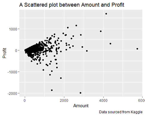
  • Examining the output and plot, it’s clear that there is a very low correlation between Quantity and Profit. This indicates that profit does not rely on the quantity sold. In other words, selling more items does not necessarily lead to higher profits. This suggests that other factors, such as pricing, cost of goods, or operational efficiency, might be influencing profitability more than the sheer volume of sales.
  1. What is the percentage achievement of sales targets for each category?

In resolving the above business question, i started by joining both Sales_Table and Sales_Target tables using the Full Join function and housed it in a new variable

Target_Table<- full_join(Sales_Table, Sales_Target)

## Joining with `by = join_by(Category)`

## Warning in full_join(Sales_Table, Sales_Target): Detected an unexpected many-to-many relationship between `x` and `y`.
## ℹ Row 1 of `x` matches multiple rows in `y`.
## ℹ Row 13 of `y` matches multiple rows in `x`.
## ℹ If a many-to-many relationship is expected, set `relationship =
##   “many-to-many”` to silence this warning.

I went ahead to calculate the percentage achieved for each category

Target_Achieved<-Target_Table %>%
  select(Category, Sales, Target) %>%
  group_by(Category) %>%
  summarise(Total_Sales = sum(Sales),
            Total_Sales_Target = sum(Target),
            Percentage_Achieved = (Total_Sales/Total_Sales_Target)*100)
print(Target_Achieved)

## # A tibble: 3 × 4
##   Category    Total_Sales     Total_Sales_Target   Percentage_Achieved
##   <chr>             <int>              <int>                         <dbl>
## 1 Clothing        7974264          165126000                4.82920
## 2 Electronics     9798996           39732000               24.66273
## 3 Furniture       7989180           32294700                24.73836

Finally, i rounded off the output and Concatenated the “%” symbol

Target_Achieved$Percentage_Achieved<-round(Target_Achieved$Percentage_Achieved, 2)
Target_Achieved$Percentage_Achieved <- paste0(Target_Achieved$Percentage_Achieved,”%”)
print(Target_Achieved)

## # A tibble: 3 × 4
##   Category    Total_Sales      Total_Sales_Target          Percentage_Achieved
##   <chr>             <int>                       <int>                                  <chr>             
## 1 Clothing        7974264            165126000                              4.83%             
## 2 Electronics     9798996           39732000                              24.66%            
## 3 Furniture       7989180             32294700                              24.74%

  • Based on the analysis, Furniture led in target achievement with a 24.74% rate, closely matching the performance of Electronics. Despite running at a loss, the data indicates demand, and with adjustments, profitability could be achieved. Electronics ranked second with a 24.66% achievement rate, outperforming Clothing but still showing room for improvement. This relatively higher achievement suggests stronger performance or more effective sales strategies for this category. Clothing achieved only 4.83% of its sales target, indicating a significant shortfall. This suggests potential issues in sales strategies or market conditions affecting clothing sales. However, it is important to note that higher targets were often allocated to clothing, possibly due to its higher profitability compared to other categories.
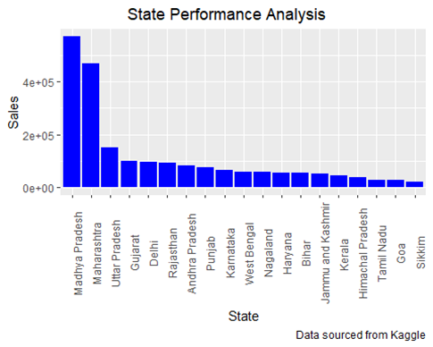
  1. How does the sales performance vary across different states?

State_Sales<- Sales_Table %>%
  select(State, Sales) %>%
  group_by(State) %>%
  summarise(Tol_Sales = sum(Sales)) %>%
  arrange(desc (Tol_Sales))
 print(State_Sales)

## # A tibble: 19 × 2
##    State                                   Tol_Sales
##    <chr>                                      <int>
##  1 “Madhya Pradesh”               569685
##  2 “Maharashtra”                     467660
##  3 “Uttar Pradesh”                  150032
##  4 “Gujarat”                             100292
##  5 “Delhi”                                   97071
##  6 “Rajasthan”                          94050
##  7 “Andhra Pradesh”                82897
##  8 “Punjab”                               77591
##  9 “Karnataka”                         66231
## 10 “West Bengal”                    58035
## 11 “Nagaland”                         57985
## 12 “Haryana”                          54891
## 13 “Bihar”                               54082
## 14 “Jammu and Kashmir”      53201
## 15 “Kerala ”                            46158
## 16 “Himachal Pradesh”         39850
## 17 “Tamil Nadu”                     29195
## 18 “Goa”                                27919
## 19 “Sikkim”                            20045

Visualizing the above

State_Sales$State<- factor(State_Sales$State, levels = State_Sales$State[order(-State_Sales$Tol_Sales)])

ggplot(State_Sales, aes(x = State, y = Tol_Sales)) +
  geom_bar(stat = “identity”, fill = “blue”) +
  labs(title = “State Performance Analysis”, X = “State”, y = “Sales”, caption = “Data sourced from Kaggle”)+
  theme(axis.text.x = element_text(angle = 90)) +  theme(plot.title = element_text(hjust = 0.4))

  • Madhya Pradesh was the top performing state for the period under review
  1. Can we identify any monthly seasonal trends in sales for each category?

ggplot(Sales_Table, aes(x= Order.Date, y= Sales, colour = Category)) +
  geom_line() +
  labs(title = “Monthly Seasonal Trend in Sales”, x = “Year”, y =”Sales”, caption = “Data sourced from Kaggle”)+
  scale_color_manual(values = c(“Clothing” = “red”, “Electronics” = “magenta”, “Furniture” = “blue”)) +
  facet_wrap(~Category)+ theme(axis.text.x = element_text(angle = 90))

  • From the above analysis, Clothing sold more in August during the summer season. Electronics recorded higher sales in January during the winter season, while Furniture saw more sales in March during the spring season.
  1. Are there any outliers in terms of order amount or profit that need further investigation?

ggplot(data = Sales_Table, aes(x = Amount, y = Profit))+
  geom_point(fill = “blue”) + labs(title = “A Scattered plot between Amount and Profit”, x = “Amount”, y = “Profit”,
                                   caption = “Data sourced from Kaggle

  • The scattered plot between Amount and Profit revealed several data points that can be considered outliers, which may require further investigation:
  1. High Amount, Low Profit: There are points with high amounts (greater than 4000) but relatively low profit. These outliers indicate transactions where a large amount was involved but did not yield proportional profit, suggesting possible inefficiencies, pricing issues, or unexpected costs.
  2. High Loss: A few data points show significant losses (ranging from -1000 to -2000) at various amount levels. These outliers may indicate problematic transactions where the cost exceeded the revenue by a substantial margin, warranting investigation into the reasons behind these high losses.
  3. Isolated Points: Points that are isolated from the main cluster, especially the one with a profit higher than 1000 or a loss lower than -1000, are outliers. These could be due to exceptional circumstances, errors, or unique cases that differ significantly from the typical transaction.

To conclude, the outliers in the scatter plot, which are far from the main cluster of points, suggest areas where business processes or transactions need to be examined. These points indicate unusual transactions that might reveal issues or anomalies that should be investigated further.

Conclusion

The analysis of the Indian e-commerce dataset reveals insightful trends in sales performance across different product categories. Electronics emerged as the top-performing category with the highest total sales revenue. Furniture, while also having significant sales, shows a negative average profit margin, indicating it is being sold at a loss. Clothing, despite having the highest average profit margin at 1.68%, had the lowest percentage achievement of sales targets at 4.83%. Additionally, Indore recorded the highest number of orders among all cities. This comprehensive analysis underscores the critical need for category-specific strategies to enhance profitability and achieve sales targets effectively.